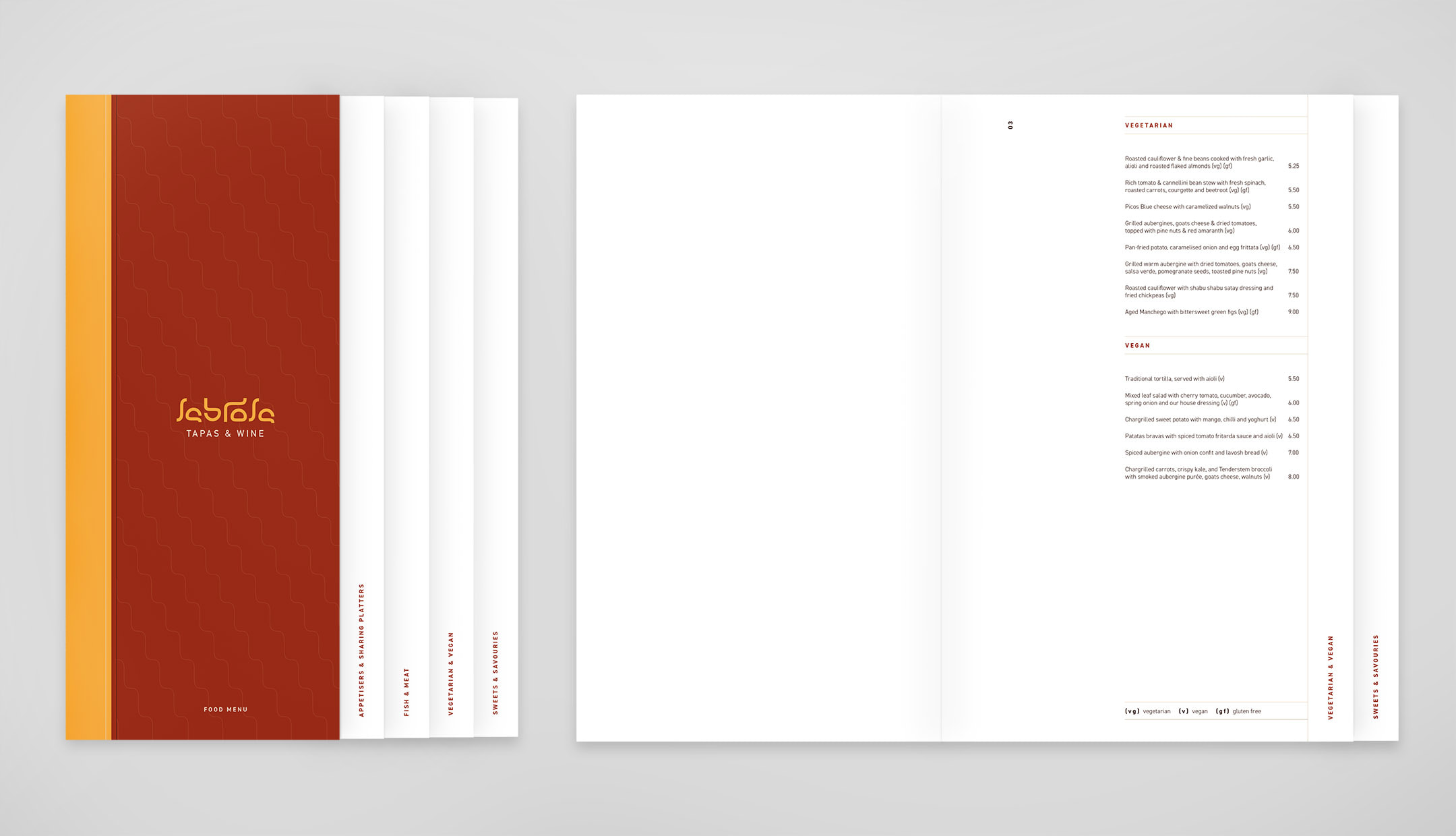
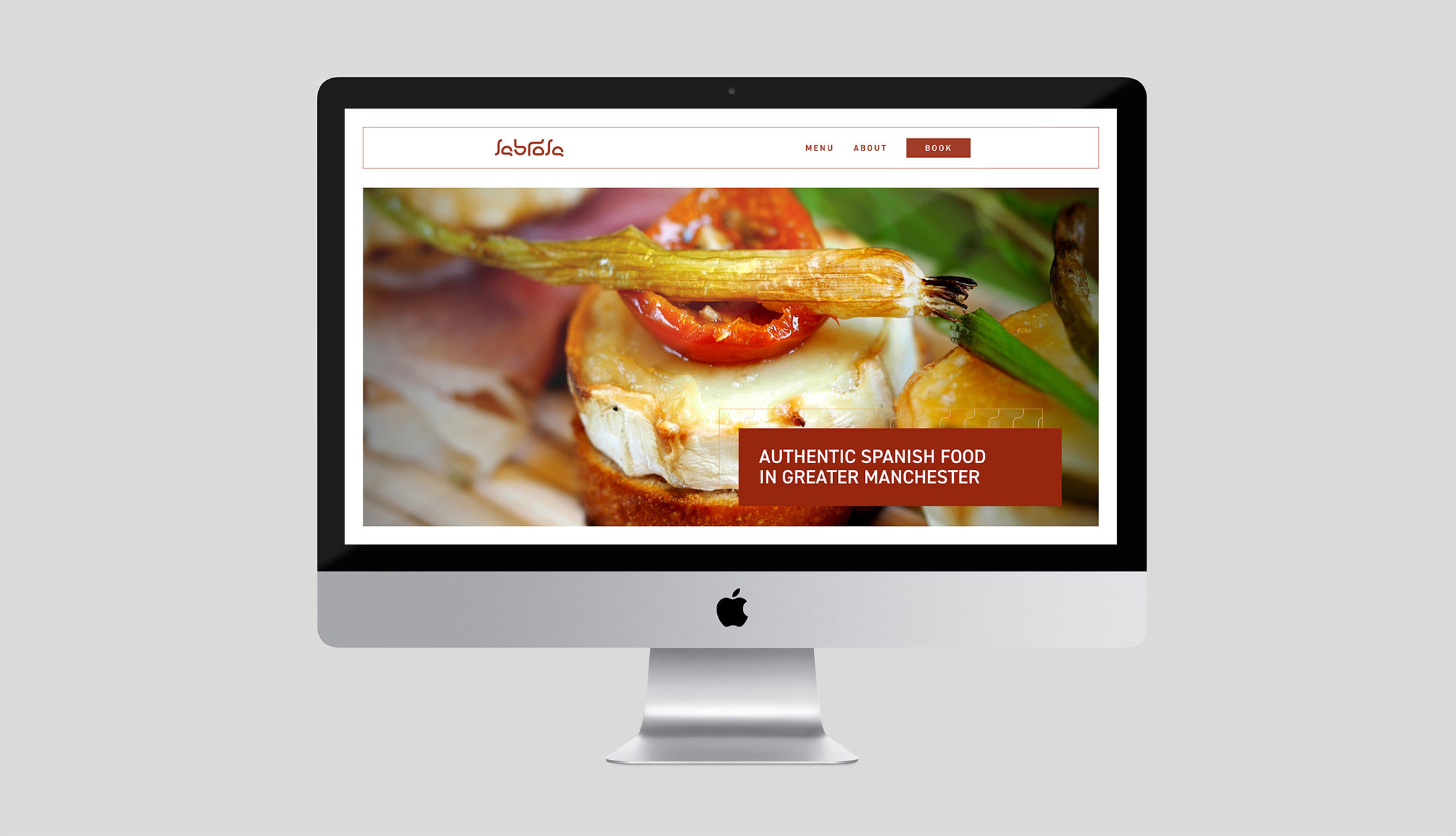
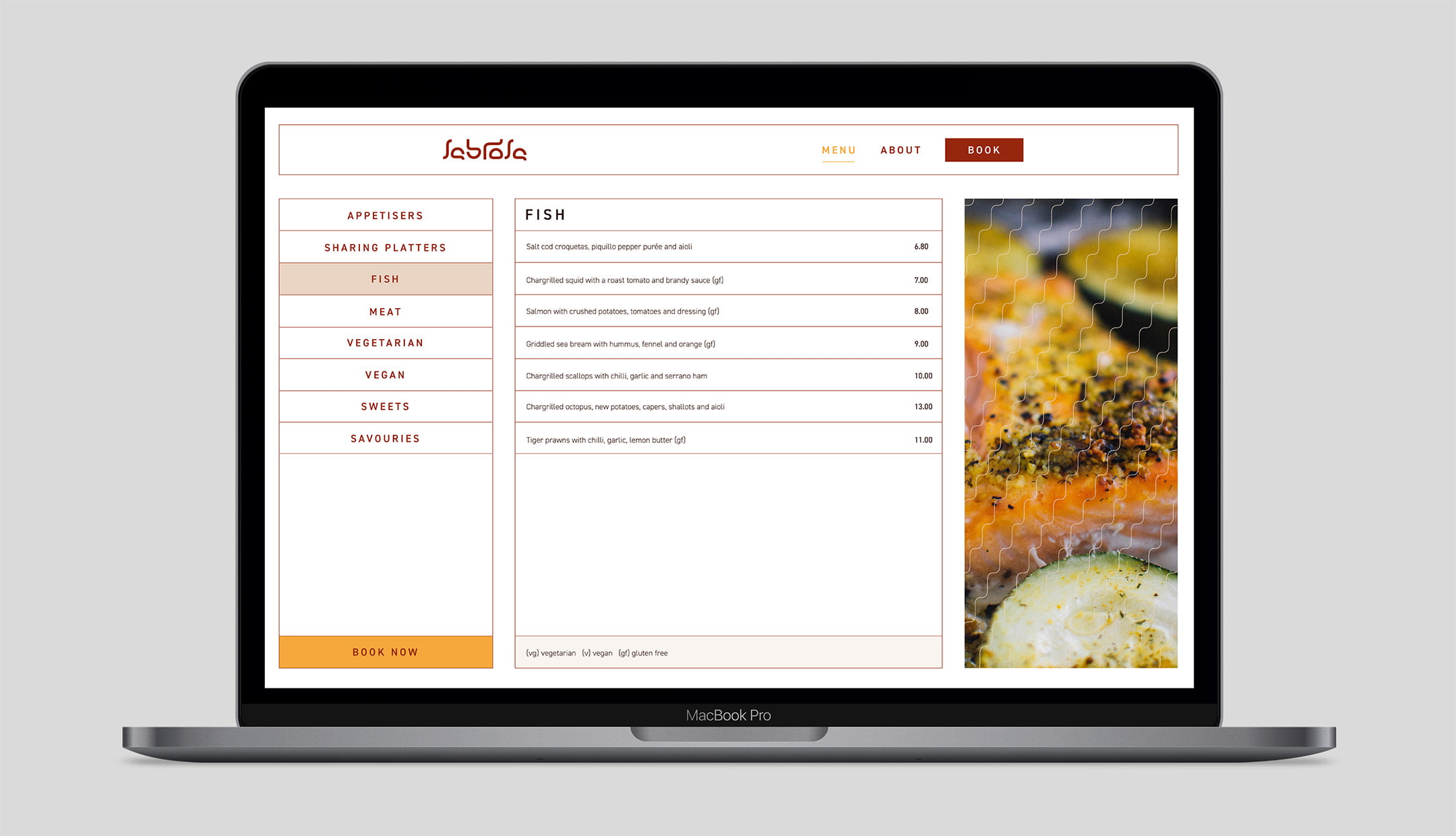
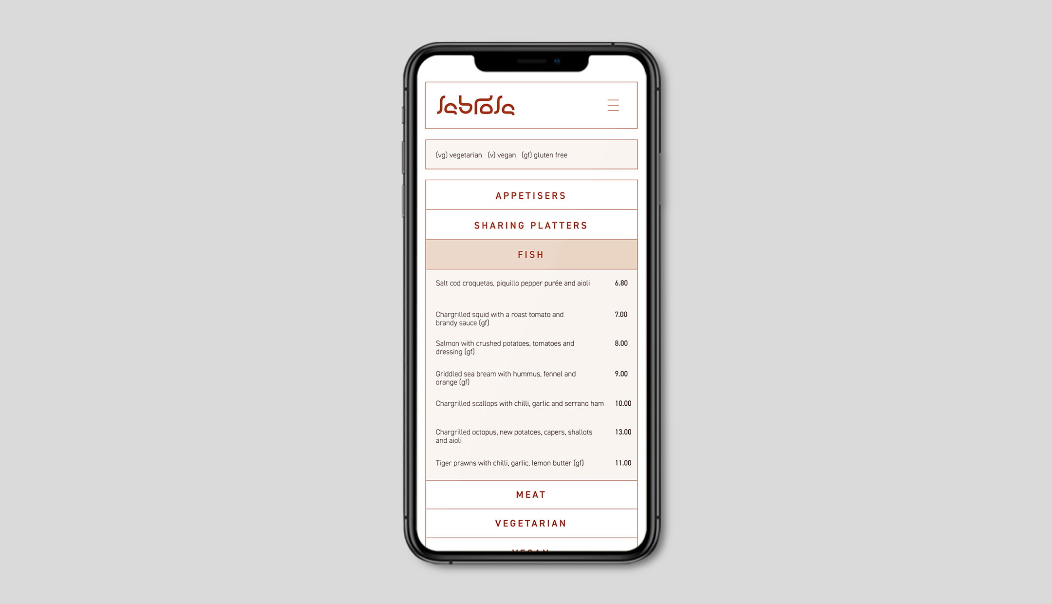
Branding / Print / Digital
Sabrosa required a slick, recognisable logo for their new restaurant based in Birmingham. To go with this, they needed a website focusing on a simple UX to showcase their menu and offers to potential customers.
The logo uses different shapes to make up the letterforms, symbolising the huge variety of dishes on offer in the restaurant. The website has big feature images to showcase some of the dishes, and an easy to use, clear typographic menu, complimenting the printed menu.