Branding / Print / Digital
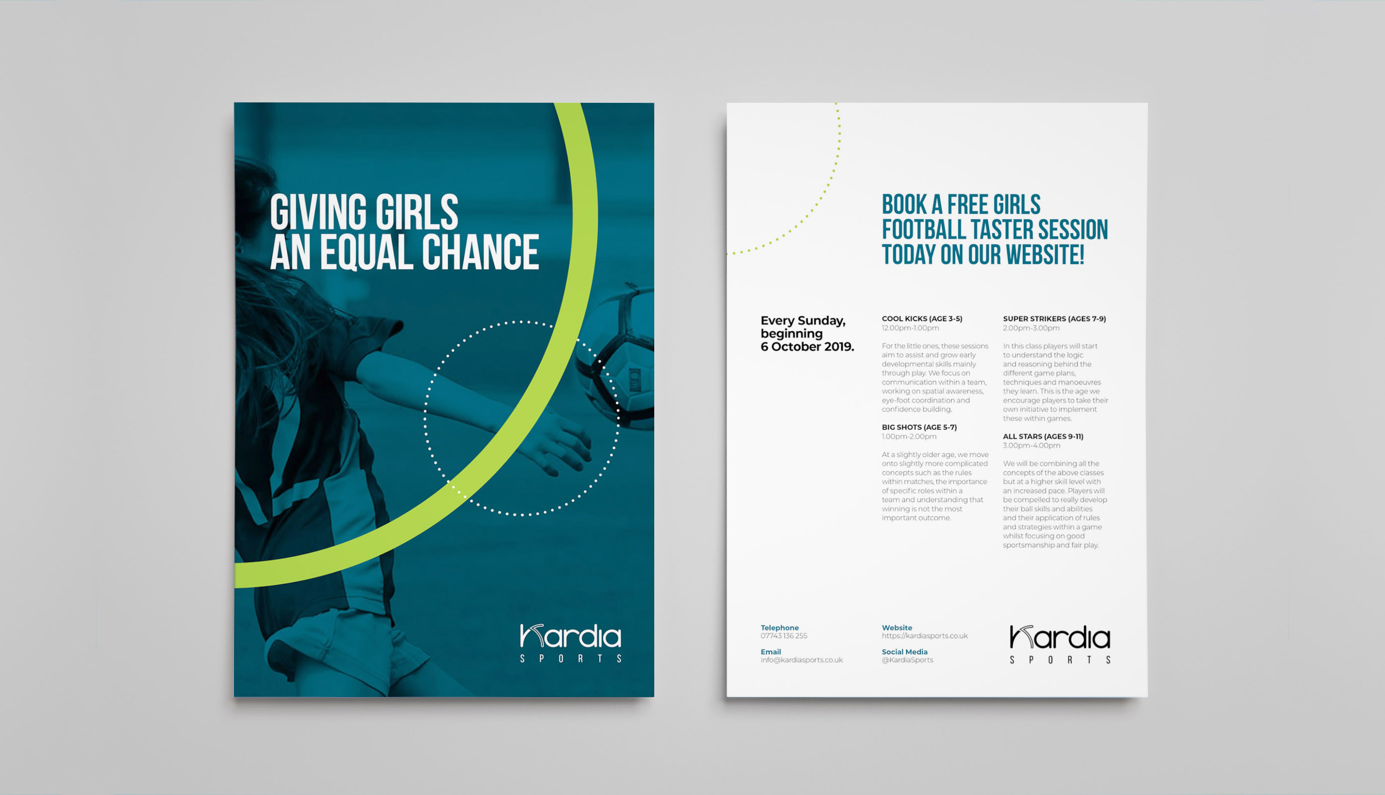
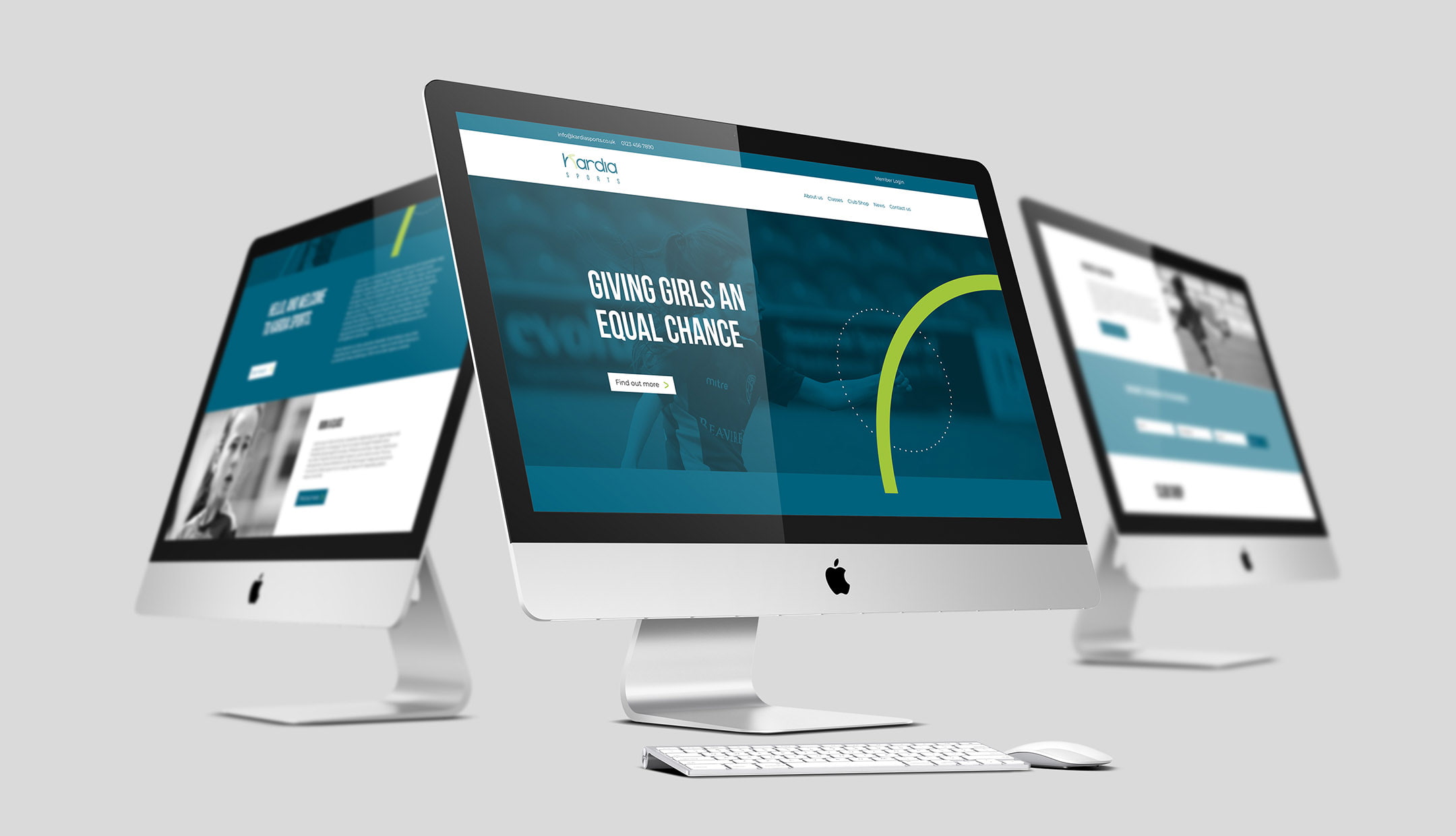
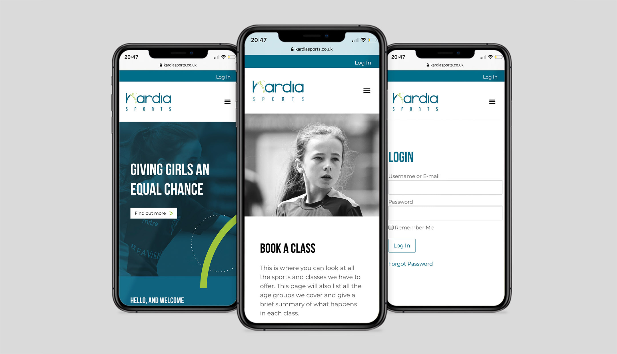
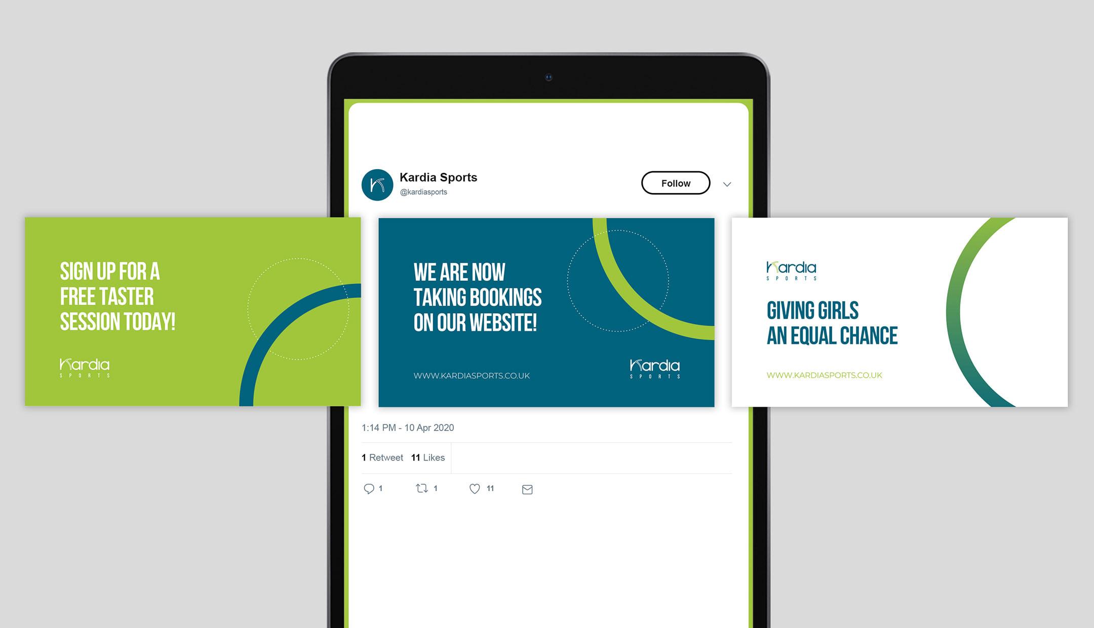
Kardia needed a new company name, brand and website to kickstart their sessions, as they were a new organisation with little to no brand awareness within their industry; due to this, their classes were often no-shows so they were operating at a loss.
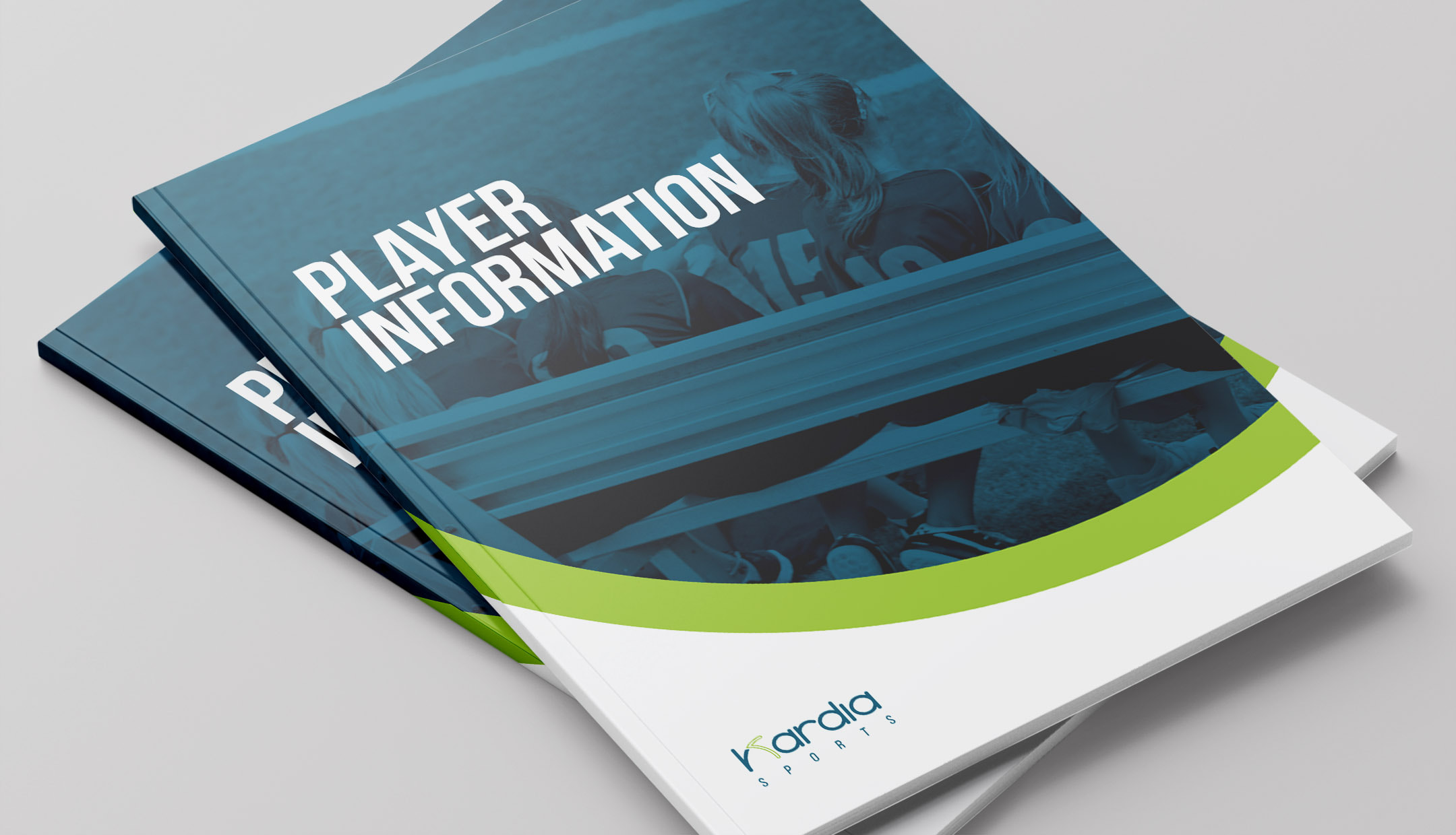
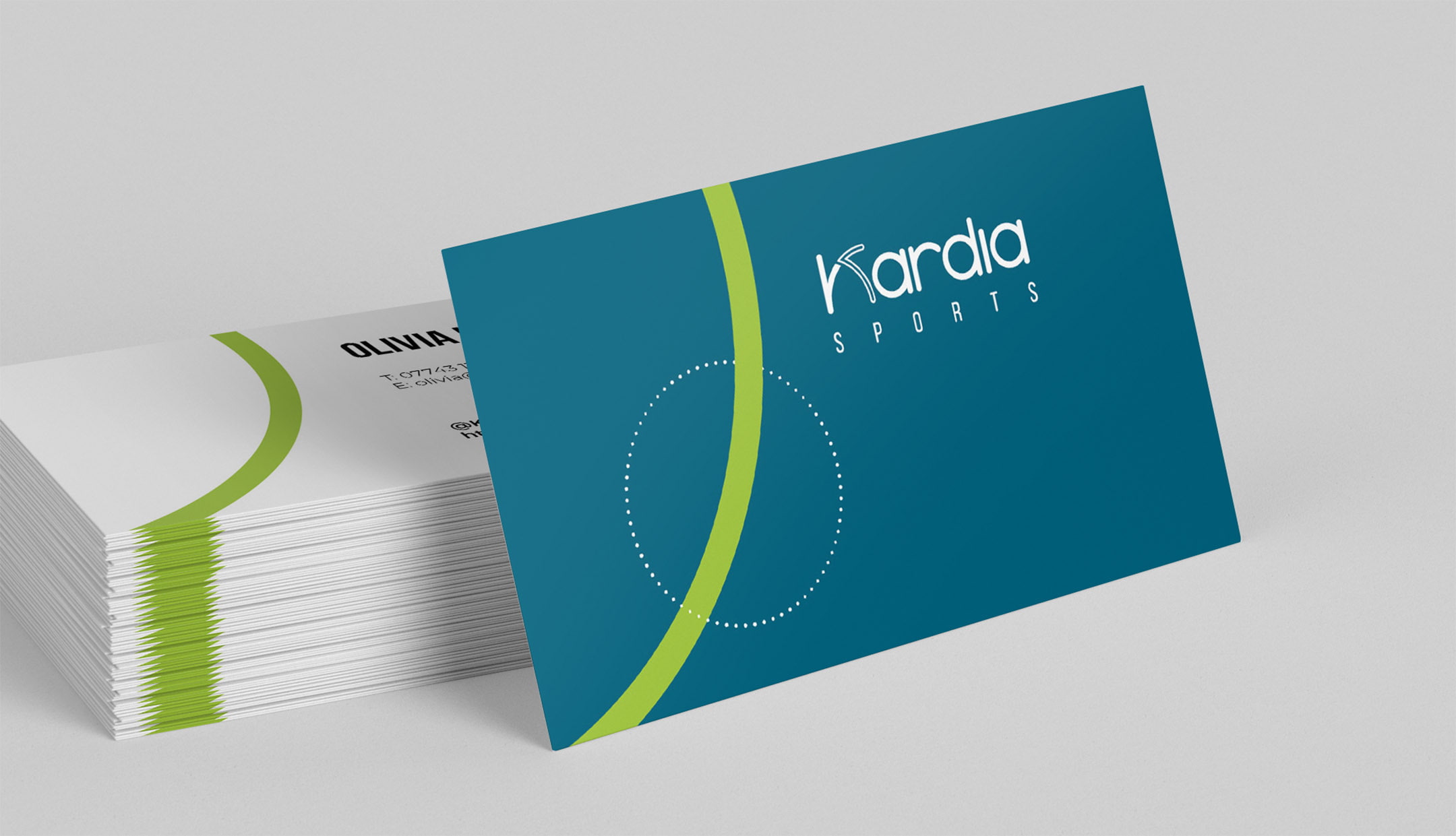
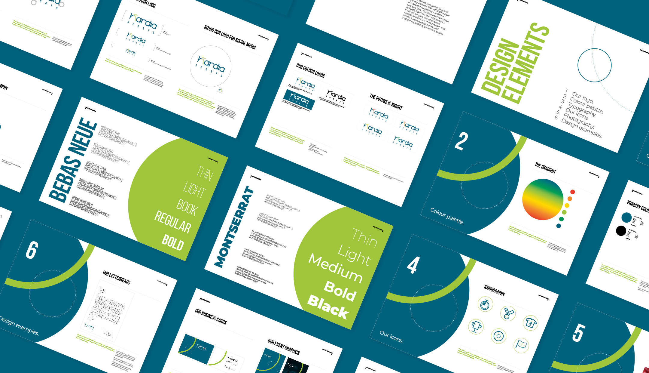
The logo was created using segments of circles, representing female energy. It acts as a basis and influences the entire visual identity, allowing for the brand to be recognisable across all communications.