Branding / Digital / Packaging
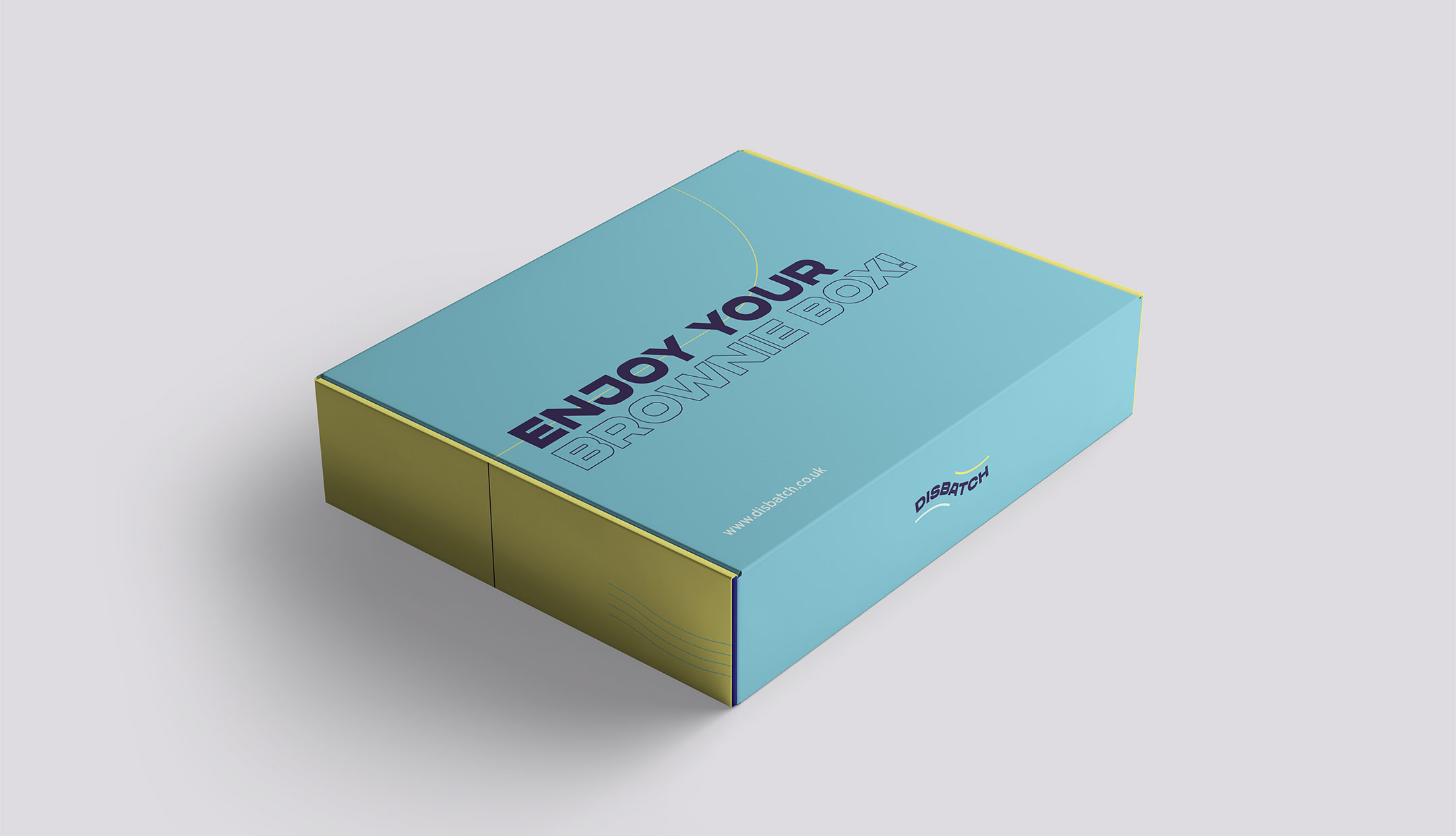
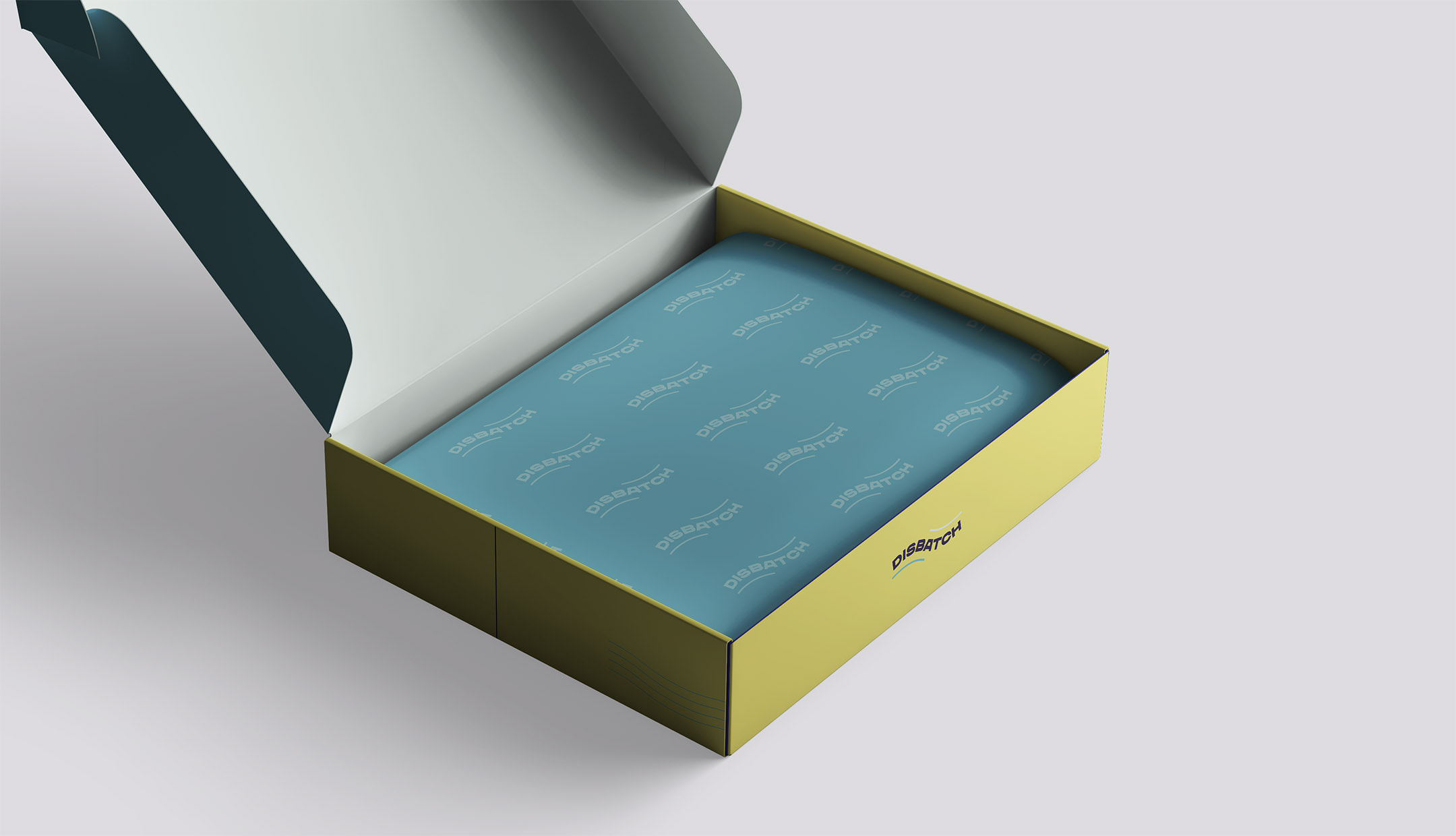
Disbatch required a bold, fun and unique brand to stand out from others, as the market had become saturated due to the pandemic and other bakeries becoming more active online.
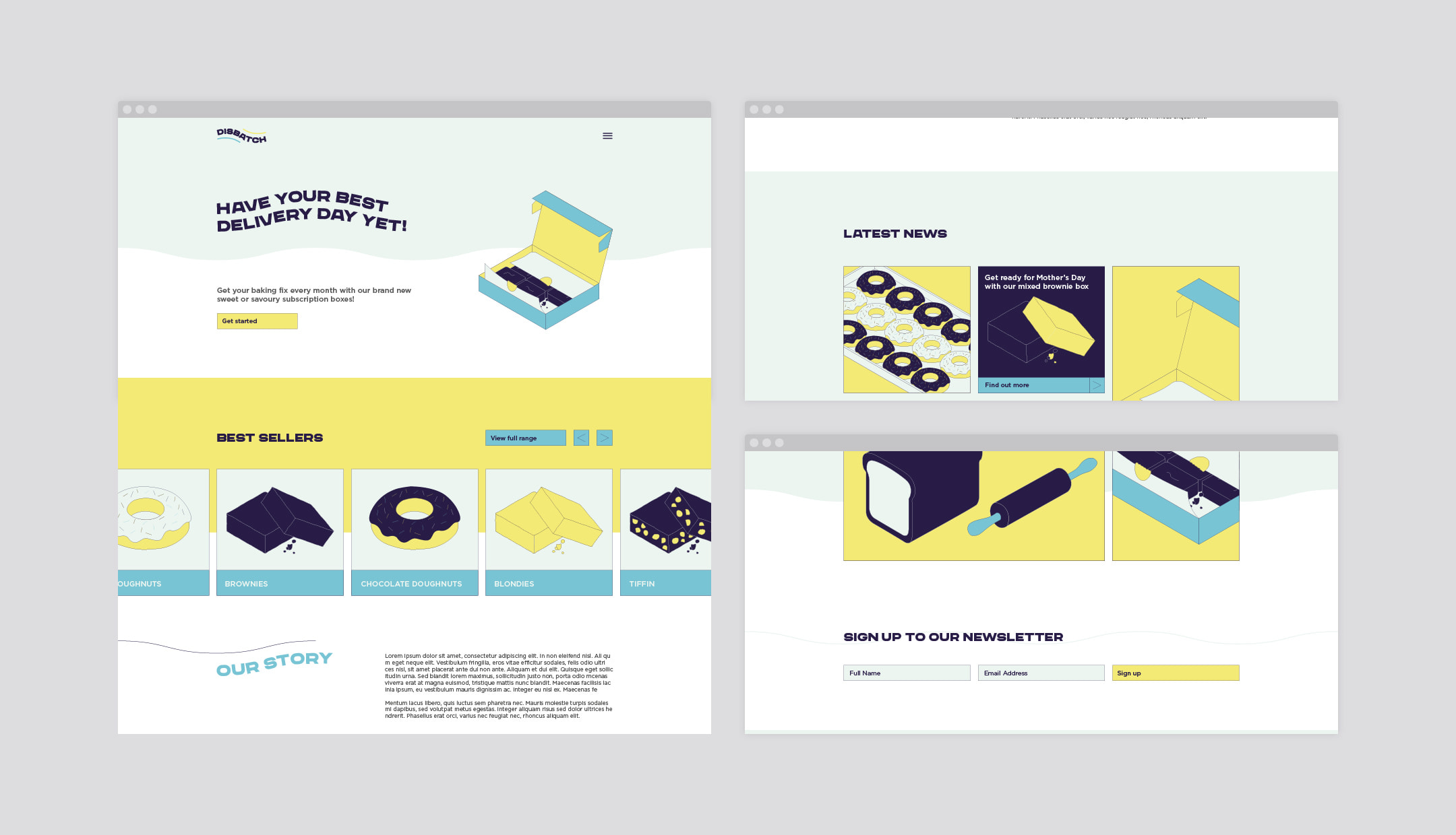
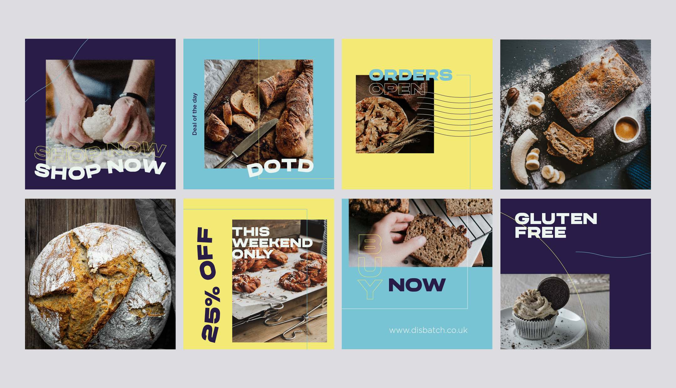
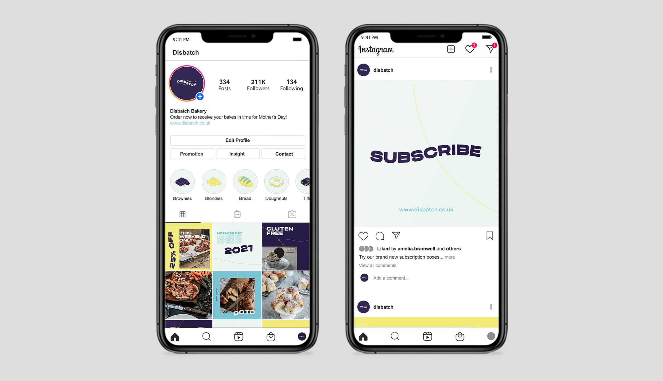
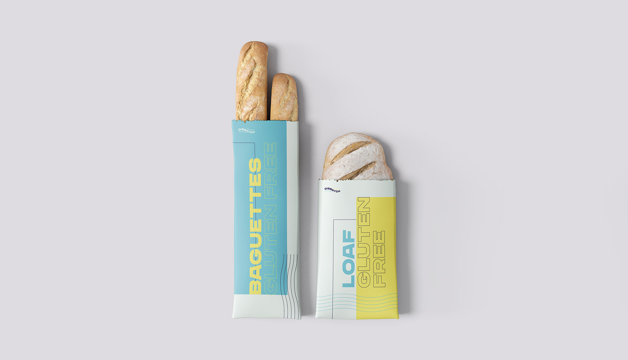
The brand was inspired by postmarks, warping the logotype into a geometric wave and embellishing with two outer waves to symbolise the movement and speed of the dispatch. Using playful colours and isometric illustrations helped showcase the individuality and boldness of the brand, further enhanced by the playful typography used across their social media and packaging.